Creating data visualizations can help you extract important information. This helps you see the big picture and gain a deeper understanding of your data.
Visualization tools such as charts, graphs, and maps make it easy to understand the dynamics, trends, and relationships between data items and draw important inferences.
Histograms are one visualization tool that can help you understand the distribution of your data.
This tutorial will show you how to create and customize histograms in Google Sheets.
Contents
- 1 How to Create a Histogram on Google Sheets
- 2 Download Our Example Spreadsheet
- 3 What is a Google Sheets Histogram?
- 4 What is it Used for?
- 5 How Are Histograms Different From Bar Graphs?
- 6 How to Make a Histogram in Google Sheets
- 7 Customizing the Histogram in Google Sheets
- 8 Frequently Asked Questions
- 9 The Bottom Line
How to Create a Histogram on Google Sheets
To create a histogram, follow these steps:
- Select the data to visualize in a histogram.
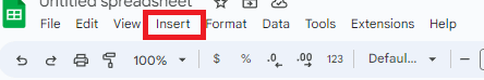
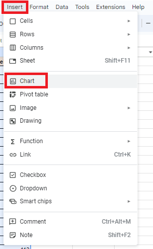
- Click the “Insert” menu from the menu bar.
- Select the Graph option.
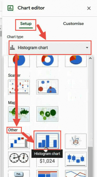
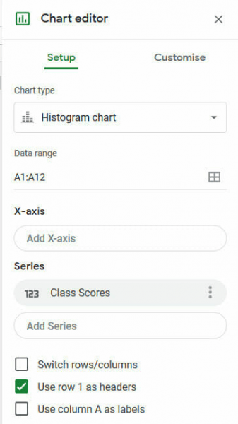
- Select the “Setup” tab from the chart editor sidebar and click the dropdown menu under “Chart type”.
- Select Histogram Chart from the chart options that appear. It should appear under the “Other” category.
Download Our Example Spreadsheet
You can download a sample template to follow along with this tutorial.
What is a Google Sheets Histogram?
A histogram is a graph that shows how variables are distributed. Divides the data range into intervals and displays the number of data values that fall in each interval. Essentially, this means that the histogram shows how often values occur within a range or data. Although similar to bar charts, there are many differences between the two. The vertical axis often represents frequency.
For example, a census containing a range of age values from 18 to 35 can use a histogram to show how often that age occurs. It can also be used with data ranges (for example, how often ages 10 to 20 appear in the census.
Each of these intervals is displayed in the form of a ‘bin’ or ‘bucket’. Visually, bins may look like bars in a bar chart, but histograms are actually quite different from bar charts.
What is it Used for?
Histograms are typically used to summarize continuous data. You can use this to view the frequencies in your data. They help identify patterns such as skew, symmetry, and multimodality in the data.
Histograms are also used in quality control processes to monitor variations in manufacturing processes and product characteristics. These can be used to identify deviations from the norm.
How Are Histograms Different From Bar Graphs?
Histograms in Google Sheets differ primarily from bar charts in terms of application.
Histograms in Google Sheets are used to understand data distribution and bar charts are used to compare variables. Histograms and bar charts also differ in the type of data plotted.
Histograms primarily plot quantitative data. So I plot how the data for a single category is distributed. Bar charts, on the other hand, plot categorical data. So we plot the amount or frequency of data in different categories.
Histograms in Google Sheets work like all other histograms. This tutorial will show you how to create a histogram to visualize your data in Google Sheets and how to further customize the histogram according to your requirements. You can also use the line of best fit in combination with the histogram.
How to Make a Histogram in Google Sheets
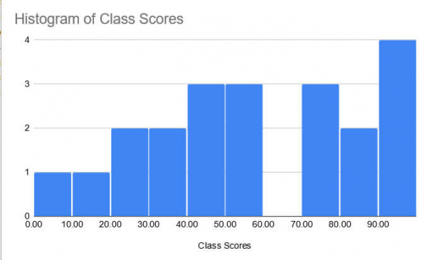
To understand how to create a histogram for Google Sheets, we will use the data shown in the image below:
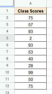
This dataset contains student scores on exams. I would like to know how to create a histogram in Google Sheets to understand how student scores on an exam were distributed.
To create a histogram of the data above, follow these steps:
- Select the data to visualize in a histogram. You can also include cells with column titles. For this example, let’s select the cells A1:A12.
- Click the “Insert” menu from the menu bar.
- Select the Graph option.
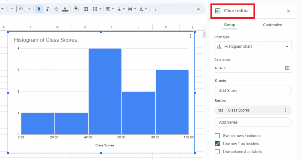
- This will display the graph in the worksheet and display the graph editor sidebar on the right side of the window.
- Google typically tries to understand the data you select and presents charts that it believes best represent it. Ideally it should show a histogram. However, if you see other types of charts, go to step 6.
- Select the Setup tab from the chart editor sidebar and click the dropdown menu under Chart Type. Select Histogram Chart from the chart options that appear. It should appear under the “Other” category.
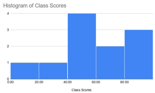
A histogram should appear in your worksheet.

Google Sheets performs its own calculations on the data and shows you how many bins it thinks fit the histogram.
However, its calculations are usually far from perfect. So usually after creating a histogram in Google Sheets, I feel the need to customize it to give it the look and functionality I want.
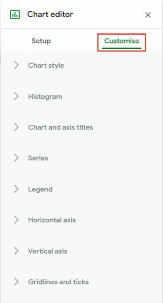
Customizing the Histogram in Google Sheets
Now that you know how to create a histogram in Google Sheets, customize it to your liking. The chart editor usually has a “Customize” tab where you can enter all your specifications.
However, sometimes the chart editor disappears after creating a Google sheet histogram.
To display the histogram again and customize the histogram, do the following:
- Click Graph.
- An ellipsis (or hamburger icon) should appear in the upper right corner of the box containing the graph.
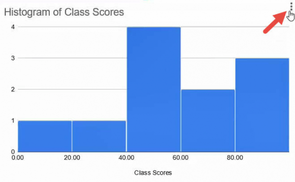
- Click the ellipsis and select Edit Graph from the dropdown menu.
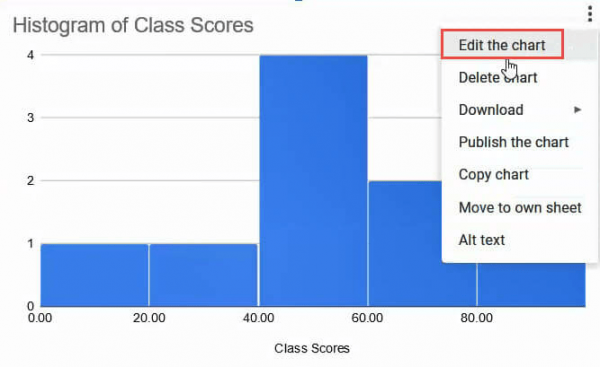
- This will bring back the chart editor sidebar.
- Click the Customize tab. Now you can make any customizations you want.
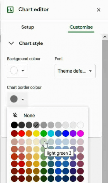
Changing the Chart Style
The Chart Style category of the Chart Editor allows you to set the background color, border color, font style, and size of your chart.
For this example, change the background color to “Light Green 3” and leave the other settings as they are.
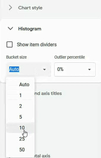
How to Change Bins
You can adjust the size of the bins to suit your requirements using the Histogram category in the Chart Editor. For example, the interval between scores displayed along the X-axis can be of very arbitrary size.
Spreading test scores over these intervals doesn’t really make much sense.
Therefore, it is good practice to set the distribution to 10 intervals.
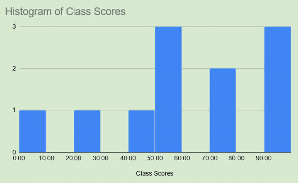
For this you need to change the “bucket size” to 10 as shown below:
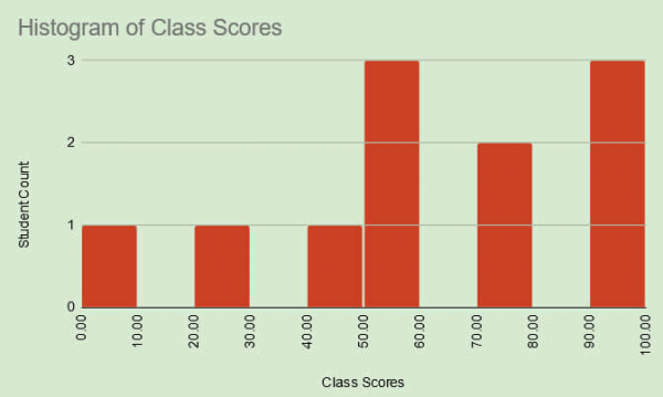
The graph shows the distribution of student scores in 10 intervals:
The outlier percentile dropdown allows you to group the outliers in your data by the closest relevant bucket. In addition to this, the Show Item Separator checkbox allows you to add lines between each item in the chart.
This may make histograms easier to read and understand.
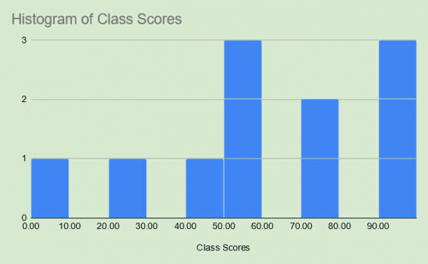
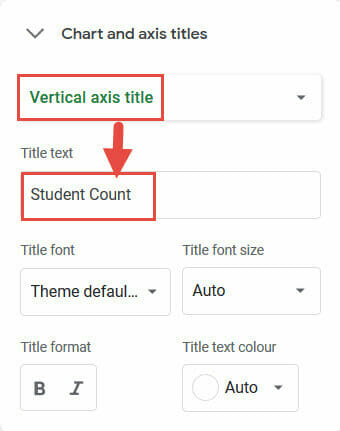
Chart and Axis Titles
This category allows you to specify the text and formatting for the chart title and subtitle, as well as titles for both the X and Y axis.
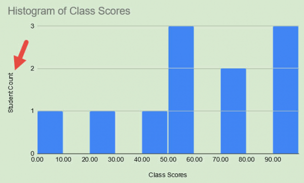
For example, you can title the vertical axis by selecting the “Vertical Axis Title” option from the dropdown menu and setting the title to “Number of Students”.
Histogram looks like this:
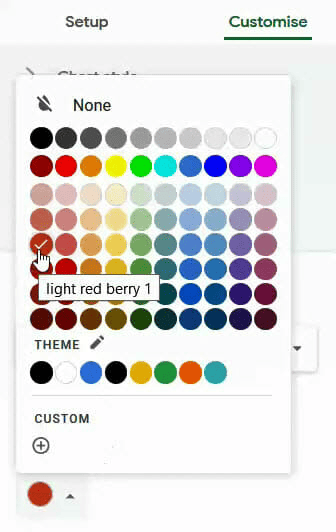
Series
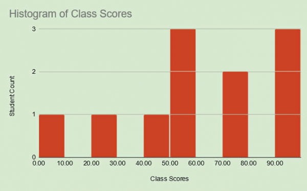
This category allows you to choose the color of the histogram bars (or bins). For example, you can use this to give your trash a “bright red berry” color.
Histogram looks like this:
This is even more useful for comparing distributions of different variables in one histogram. That way you can have different colors for each series.
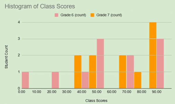
For example, if you need to compare the distribution of scores for two different classes, you can use one color for grade 6 and another color for grade 7.
Legend
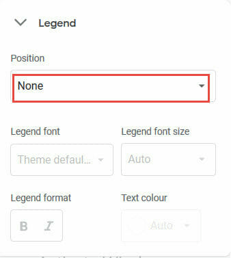
The Legend category, as its name suggests, allows you to specify settings and formatting for the histogram legend. This allows you to provide the following settings for your legend:
- The position of the legend relative to the chart. If you don’t want to keep the legend, select “None”.
- Legendfont sets the display font for the legend.
- Legend font size: Sets the font size of the legend.
- A legend format that makes the legend bold or italic.
- The text color that sets the text color of the legend.
in this example, we only have one variable, so we don’t really need a legend. So you can set the legend position to none.
Horizontal and Vertical Axes
You can use this category to change the range of the histogram. For example, you can narrow the range of values over which the bins are distributed.
In this example, it makes sense to distribute the scores between 0 and 100.
For this, we need to change the minimum and maximum values of the horizontal axis categories to 0 and 100 respectively.
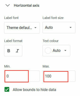
Adjusting the minimum and maximum inputs can be very helpful in providing context to your histogram.
Other settings available under these categories include:
- Use Label Font to change the horizontal and vertical axis font.
- use Label Font Size to set the font size for the x-axis and/or y-axis values.
- A label format that makes the values on the x-axis and/or y-axis bold or italic.
- To change the text color
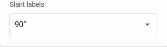
- Skew labels to display axis labels at a specific angle. For example, suppose you want your labels to be displayed at an angle of 90 degrees from the horizontal axis, as shown below.
Histogram looks like this:
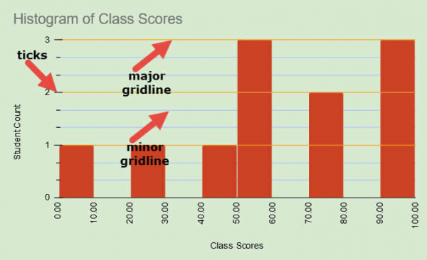
Gridlines and Ticks
Finally, you can format your histogram to include major and minor grid lines. You can also set the color of the grid lines or choose not to use grid lines at all.
This category also allows you to set and format the major and/or minor tick marks on the histogram’s vertical and horizontal axes. As before, you can also choose not to put ticks in at all.
Frequently Asked Questions
How Do I Make a Histogram in Google Sheets?
- Highlight the data for which you want to create a histogram
- Go to File > Graph or click the Graph shortcut button
- In the Graph menu, change the Graph Type to Histogram
How Do You Change the Interval on a Histogram in Google Sheets?
- Go to chart menu
- Under Histogram, find Bin Size and adjust the number to your desired interval
How Do You Title a Histogram in Google Sheets?
If it’s not added automatically, there should be a space at the top of the chart where you can click to add text. Alternatively, you can use the Chart menu under Title.
How Do You Make a Relative Frequency Histogram in Google Sheets?
Relative frequency histogram charts use percentages on the y-axis to represent frequency and the horizontal axis to represent class. It’s an easy way to analyze your data.
The first step is to create a regular data histogram by highlighting the data points, then go to Insert > Chart and under Chart Type optionally select a histogram chart. You can freely customize the histogram in the graph format window and graph title according to your needs.
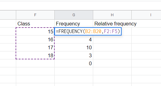
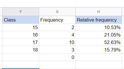
From there, you can first create a relative frequency table. To get the frequency of the data,
we use the formula
=FREQUENCY(data, class)
An example is shown below:
=Frequency(B2:B20,F2:F5)
To get the relative frequency, divide the frequency by the sum of the values and convert it to a percentage. To do this in our example, enter the following expression:
=G2/SUM($G$2:$G$5)
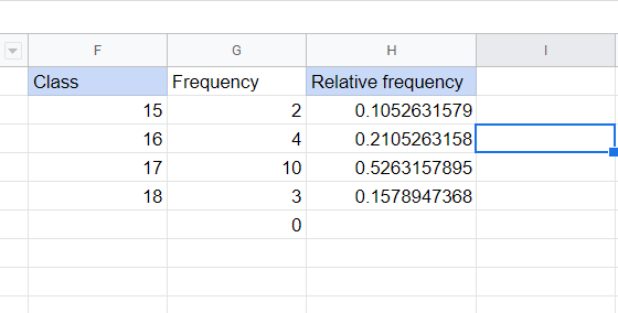
You can now convert relative frequencies to percentages. Select the column and click Format as Percentage on the toolbar.
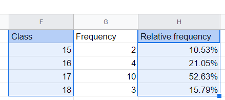
You now have a relative frequency table that you can use to create a relative frequency histogram. Select the class column, hold down the Ctrl button and select the relative frequency table.
Go to Insert > Chart > Column Chart

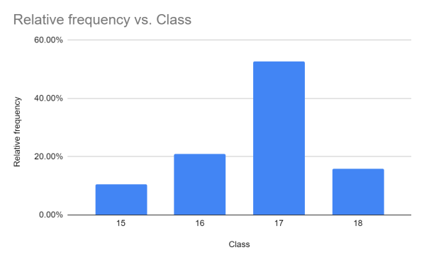
You now have a relative frequency histogram in your Google Sheets. Although in bar chart format, the information is represented and can be used as a histogram. You can use the regular histogram and compare it with the relative frequency histogram to make sure your data is accurate. You can do many things with this histogram, such as adding error bars.
If you have problems with this, you can:
Download Our Template
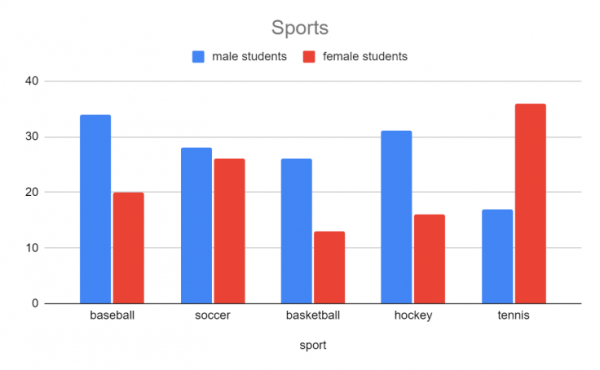
How Do I Make a Double Histogram in Google Sheets?
A histogram cannot be used to create a compound chart, but a dual histogram can be created. A double histogram contains two data distributions that are compared together. For example, if you have data about sports played by male and female students and want to compare the two, you can use a double histogram. The process of creating a double histogram in Google Sheets is very simple.
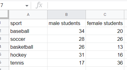
To create a double histogram in Google Sheets, simply select your dataset and go to Insert > Chart. On the Graph tab, select a column chart and customize it as desired. The double histogram is now complete. That’s all there is to creating a histogram in Google Sheets using two datasets.

If you would like to use the sample table, you can access it here.
The Bottom Line
That’s it for this tutorial. We’ve explained why and how to use histograms.
We also showed you how to create a histogram in Google Sheets and customize its various components for complete control over its format and settings.
I hope you found this tutorial helpful. You can also see how to create a bell curve in Google Sheets.
Other Google Sheets Tutorials: