Visualizing data using charts and graphs is a great way to understand the relationships between your data and the variables in your data.
Additionally, adding trend lines (also known as best-fit lines) to your charts can help you better understand your charts.
In this tutorial, we’ll show you how to add the best rows to your Google Sheets to gain better insight into your data.
Contents
- 1 What is a Line of Best Fit, and Why Add a Trendline?
- 2 How to Add a Line of Best Fit in Google Sheets
- 3 Adding Multiple Trendlines in Google Sheets
- 4 Using the TREND Function to Make a Trendline
- 5 How to Insert a Trendline in Google Sheets FAQ
- 5.1 Does Google Sheets Have Line of Best Fit?
- 5.2 How Do You Add a Line of Best Fit on Google Sheets? / Can You Add a Trendline in Google Sheets?
- 5.3 Is Trendline the Same as Line of Best Fit?
- 5.4 Where Is R2 in Google Sheets? / How Do You Find the Slope of a Line of Best Fit In Google Sheets?
- 5.5 Which Equations Should You Use From the Types Menu?
- 6 Wrapping Up the Line of Best Fit Tutorial
What is a Line of Best Fit, and Why Add a Trendline?
A trend line, or “line of best fit,” is superimposed on a chart to help you understand trends in your data.
These lines help you understand the direction of your data, make predictions, and understand the relationships between data elements.
For example, the scatterplot below gives some idea of how the data points are distributed, but it is difficult to tell if there is an upward or downward trend. Also, the distribution is a bit difficult to understand properly.
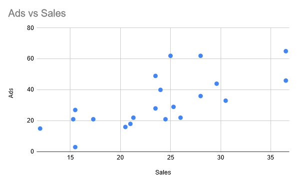
What happens if we add a trendline to this chart?

Adding trend lines as shown above can put a lot into perspective.
You can see that the data is moving upwards.
You can also extrapolate lines to predict future data points, letting you know which data points are outliers or completely deviated from the general trend.
Trend lines can be added to bar charts, line charts, column charts, or scatter charts. In the next section, we’ll show you how to add a trendline to your Google Sheets to fit your scatterplot.
How to Add a Line of Best Fit in Google Sheets
Before I explain how to add a line of best fit, I will first briefly explain how to create a graph for the data shown below:
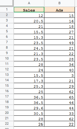
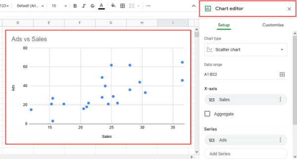
The image above has data on the number of ad impressions and the number of sales.
A scatterplot is the best way to visualize this type of data.
I’ll show you how to use this data to easily create a scatterplot in Google Sheets.
Creating a Scatter Chart in Google Sheets
To create a scatterplot based on given data, follow these steps:
- Select the data range that contains the column headers. For this example, select the range A1:B22.
- Click the “Insert” menu from the menu bar.
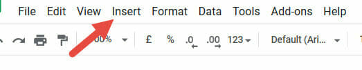
- Select the Graph option from this menu.
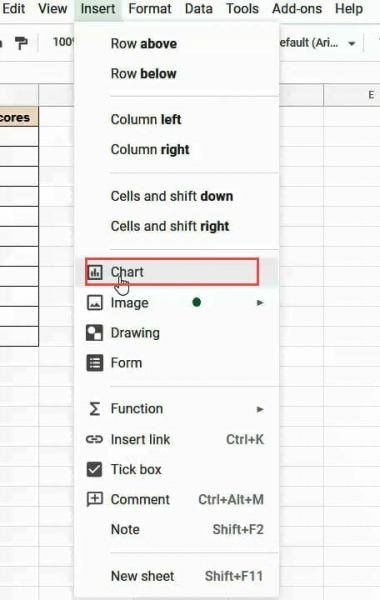
- The graph appears in the worksheet and the Graph Editor sidebar appears on the right side of the window.
- Google usually tries to predict and recommend charts depending on the data you choose. If the displayed graph is not a scatterplot, go to step 6. Otherwise, stop here.
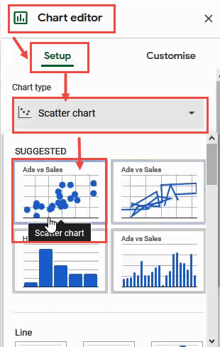
- To convert the displayed chart to a scatterplot, from the chart editor select the ‘Settings’ tab and click the dropdown menu under ‘Chart type’.
- Select Scatterplot from the chart options. This should be under the “Recommended” or “Other” category.
You should now see a scatterplot in your worksheet. Then add a line of best fit to help you understand trends in your data.
How to Find the Line of Best Fit on Google Sheets
Google Sheets does not have a best-fit equation line that you should use. Just add some customizations to the graph.
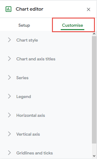
The chart editor sidebar consists of two tabs: Settings and Customization. The Customize tab has various options that help you customize various chart settings.
To add the best lines to your scatterplot, you will need to access this Customize tab. Follow these steps:
- Click the Customize tab in the chart editor.
- Select the Series dropdown menu.
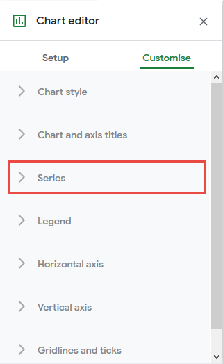
- Scroll down the drop-down menu and you’ll see three checkboxes.
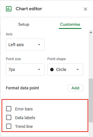
- Select the “Trend line” checkbox.
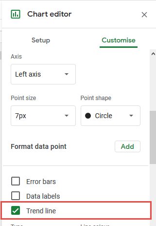
This will give you a trend line (or best fit line) across the scatterplot.
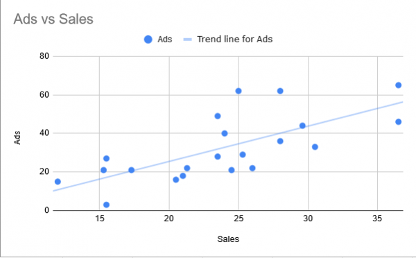
In this example, we can see that the trend graph shows an upward trend. This means that as the number of ads increases, sales will start to increase.
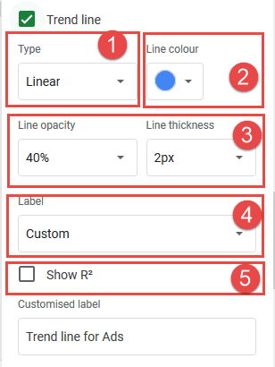
Making Changes to the Trend Line
I know how to find the line. If you want to customize the trend line further, you should do the following: Below the trend line checkboxes are a number of options for customizing the trend line. For example, you can:
- Change the type of trendline. You have the option to select linear, exponential, polynomial, logarithmic, power series and moving average trend lines.
- Change the line color.
- Change the opacity and thickness of the trend line.
- Change the label of the trend line.
- Display the R2 value. This value helps you see how well the trend line fits your data. The closer this value is to 1, the better the fit.
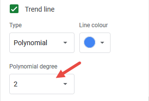
- When you select Polynomial as the trend line type, you also have the option to select the degree of the polynomial.

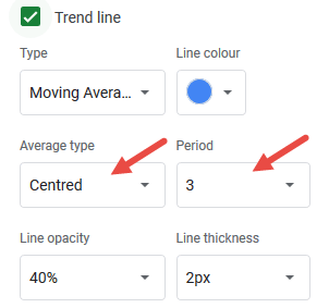
- If you select Moving Average as the trend line type, you will have the option to select the type of average (i.e tail or center). You can also select the number of periods for the moving average trend line.
Experiment with different options until you finally get a trend line that gives you enough insight into your data.
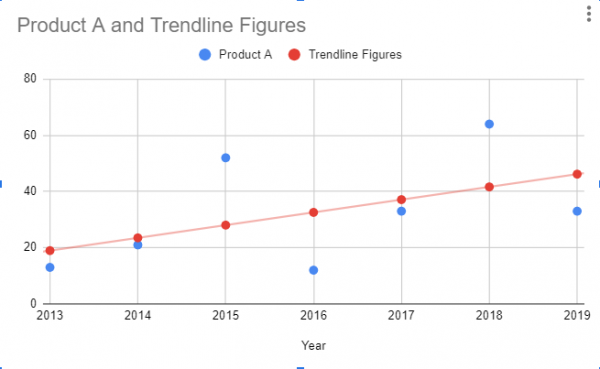
Adding Multiple Trendlines in Google Sheets
If your scatterplot has multiple series, you can add a trendline for each set of data. Let’s see an example:
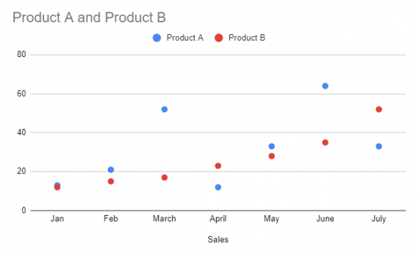
Suppose you want trendlines for both product A and product B. Here’s how:
- Go to Chart Editor > Customize > Series
- Make sure Apply to all series is selected in the dropdown list
- Check the “Trendline” box
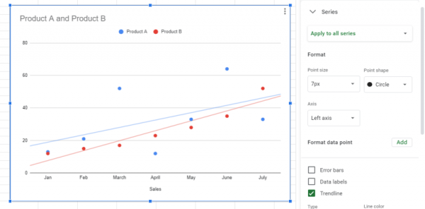
You can also add trendlines to individual data sets rather than adding them all at once by selecting a series from the dropdown menu instead of Apply to all series.
Using the TREND Function to Make a Trendline
The TREND function is used to predict potential future values trendline Google Sheets to make lines of best fit in existing data. It works with the following syntax:
=TREND(known data y, [known data x], [new data x])
to use it with a dataset, you enter the known y-values and x-values in their respective locations, also specify the new x-values, and it predicts possible new y-values based on the existing data. The trick to working with the current values is to use the known x values as the new_data_x values as well. Here’s an example of how to use the TREND function to add the best lines to your Google Sheets. Suppose you have the following values in your sheet:
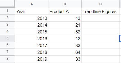
we can substitute the x and y values into the trend function as follows:
=TREND(B2:B8,A2:A8,A2:A8)
Note that Know_data_x and new_data_x are the same. You will get a result like this:
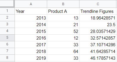
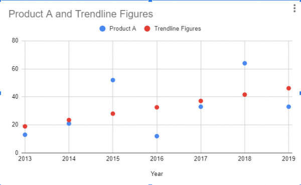
You may notice that the numbers in the trend line are increasing at a steady rate, rather than sporadically like the initial data. Graphing the data shows a clear trend.
Of course, you can also add physical rows to your data in the same way you did in other examples.
This is a complicated method of creating a best-fit line in Google Sheets, so we recommend using only the TREND function for forecasting.
How to Insert a Trendline in Google Sheets FAQ
Does Google Sheets Have Line of Best Fit?
Yes, but it’s called a trendline instead,
How Do You Add a Line of Best Fit on Google Sheets? / Can You Add a Trendline in Google Sheets?
Here it is how to make a trendline in Google Sheets.
- Open the chart editor and go to “Customize
- On the Series tab, check the box labeled Trend Line.
Is Trendline the Same as Line of Best Fit?
Yes, some people claim that the best-fit straight line applies only to linear equations, but in Google Sheets it means the same thing.
Where Is R2 in Google Sheets? / How Do You Find the Slope of a Line of Best Fit In Google Sheets?
Finding the slope in Google Sheets is just a few clicks away.
- Go to Chart Editor > Customize > Series
- Make sure Trendline is checked
- Change the label to “Use Equation” to view the slope equation
- Check the R2 box to display the R2 slope
Which Equations Should You Use From the Types Menu?
The equation selected from the Type drop-down menu is best fit line in Google Sheets. A brief description of each:
- Linear: creates a best-fit straight line from the data points
- Exponential function: rate of increase or decrease from the first data point.
- Logarithmic: a rapidly increasing or decreasing set of data that flattens out over time
- Polynomials: For Various Data
- Power series: for a constant increase or decrease from the initial value
- Moving average: smooths erratic data
There are no bell curve options.
Wrapping Up the Line of Best Fit Tutorial
In this tutorial, we’ve shown you how to add the best rows to your Google Sheets to analyze your data and make effective inferences.
Best-fit lines (or trend lines) help you observe trends and patterns in your data, help you understand how closely related your data points are to each other, and help you identify outliers in your data help. Hard to find.
We hope you find this tutorial useful.