Org charts in Google Sheets are often used in presentations and reports. This is a simple graph showing the hierarchy of who reports to whom within an organization.
Below is an example of a simple organizational chart.

If you thought creating those text boxes and flowchart diagrams would take a lot of time, good news! Just a few clicks and you’re done.
Charts in Google Sheets have a built-in chart type called Org Chart. Just put your data in a table and Google Sheets will do all the building of your org chart for you.
This tutorial will show you how to create an organization chart in Google Sheets.
Let’s get started!
table of contents
1
- Skill up first
- How to create an org chart in Google Sheets with the right data
- Free Org Chart Template for Google Sheets
- How to create an organization chart in Google Sheets
- Adding Names to Google Hierarchy Charts
- Include each employee’s job title with a tooltip
- Add a name as part of the dataset
- How to Create a Hierarchical Diagram in Google Docs
- Adding Names to Google Hierarchy Charts
- Google Sheets Org Chart Example – Customize Org Chart
- How to change node color
- Download the org chart from Google Sheets (as image or PDF)
- Publish your org chart
- What to do if the org chart is too wide to display
- FAQ
- How do I create an org chart in Google Sheets?
- Does Google have an org chart template?
- Can I create a horizontal org chart in Google Sheets?
- What’s the easiest way to create an org chart?
Contents
- 1 Up Your Skills First
- 2 How to Make an Org Chart in Google Sheets With the Right Data
- 3 Free Organizational Chart Template for Google Sheets
- 4 How to Create an Organizational Chart in Google Sheets
- 5 Google Sheet Org Chart Examples – Customizing the Org Chart
- 6 Downloading the Org Chart from Google Sheets (as Image or PDF)
- 7 Publish an Org Chart
- 8 What to Do if the Org Chart is Too Wide to Display
- 9 Frequently Asked Questions
Up Your Skills First
G Suite is Google’s powerful collection of apps and programs designed to boost your productivity. But only if you know how to use them efficiently. Browsing our site will help with this, but if you want to structure your learning a little more, check out Udemy’s excellent G Suite guide.
How to Make an Org Chart in Google Sheets With the Right Data
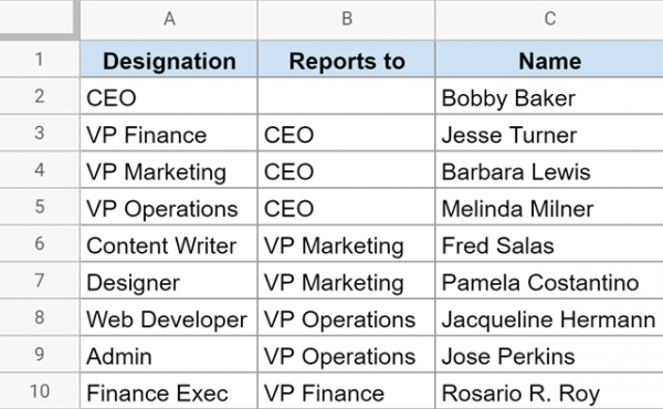
The first step in creating an org chart is making sure your Google Sheets has the data in the correct format.
First, we only need two columns. One column shows the designation and the other column shows who this person (who holds the designation) reports to.
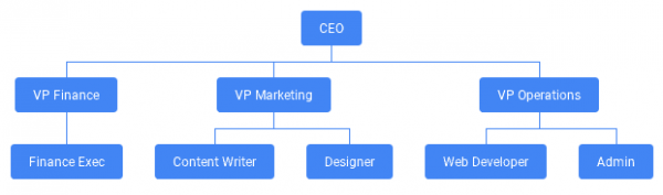
Below is a table for small organizations. Column A has the designations, and column B has the direct designations of the person in column A.
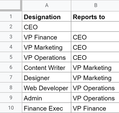
For example, the CEO doesn’t report to anyone, but the VP of Marketing reports to the CEO.
Now. Use this data to create a Google Sheets org chart.
Free Organizational Chart Template for Google Sheets
Download the Google Sheets org chart template here and follow the steps below. We also offer other free OKR templates for use in Google Sheets
How to Create an Organizational Chart in Google Sheets
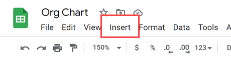
Here’s how to create an org chart in Google Sheets using the table you created:
- select the entire dataset
- Click the “Insert” option in the menu
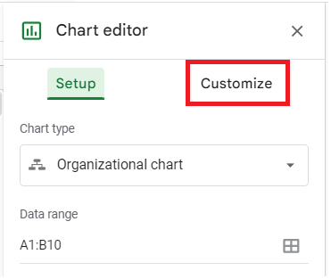
- Click “Chart”. This will insert an empty chart and open the chart editor sidebar on the right.
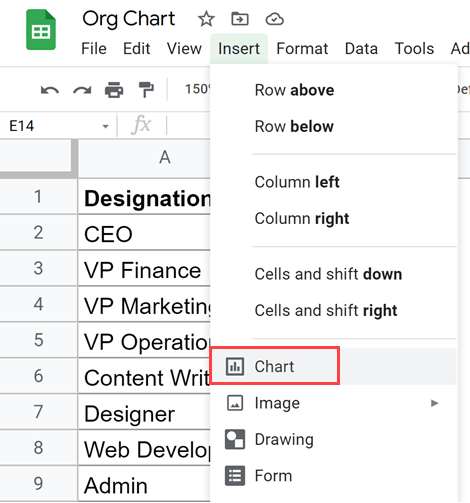
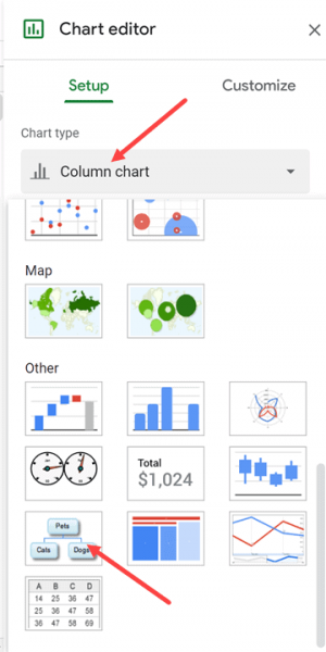
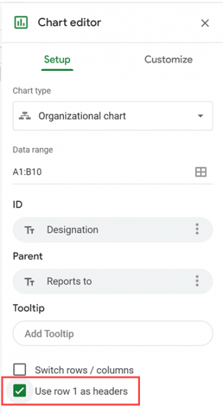
- Within the Chart Editor sidebar Settings tab, click the Chart Type dropdown
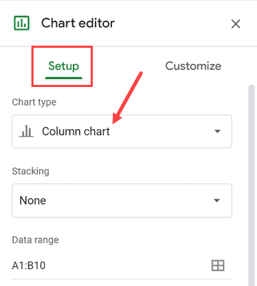
- Scroll down and select the “Organization Chart” option
- Check the “Use row 1 as header” option
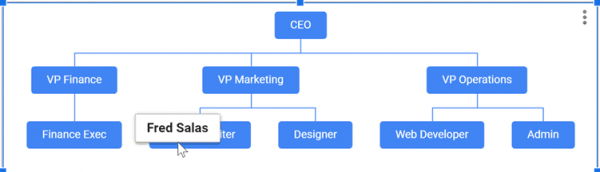
The above steps will insert a Google Sheets org chart with the selected data (see below).
This diagram is linked to the table, so any changes made to the table will be reflected in the organization chart in real time.
Adding Names to the Google Hierarchy Chart
After creating an org chart in Google Sheets, if you also want to know the names of people who hold positions, there are two ways to do this in Google Sheets.
- The employee name is displayed whenever the cursor hovers over the box containing the designation
- Include the name on the box itself as part of the specification
Let’s take a look at each method.
Include Job Titles for Each Employee by Using Tooltips
This way you can add a column to add the names of people with a certain designation (see below).
Notice that we added a name column to the right of the two existing columns. This makes creating an org chart a little easier.
If you prefer, you can arrange the org chart to put the name column first (as the leftmost column) and get the appropriate data from the right column.
To create a named org chart in Google Sheets:
- select the entire dataset
- Click the “Insert” menu
- Click “Chart
- In the Chart Editor, on the Settings tab, click the chart type dropdown menu
- Please select an organization chart
- Check the “Use row 1 as header” option
The above procedure inserts into the same org chart that was inserted above without a name.
However, if you select the chart and hover over any of the boxes, you’ll see the name of the person holding that designation.
The advantage of using this technique is that it does not take up much space and at the same time gives additional information about the person’s name.
On the other hand, the downside is that if you export this graph as a PNG or PDF file, you will lose the ability to get the name as a tooltip when clicking a box.
Adding Name as the part of the Dataset
This method is exactly the same as the first one described.
The only difference is that here, in addition to the designation, the name of the person who owns the position is also listed.
Below is the dataset used to create this org chart.
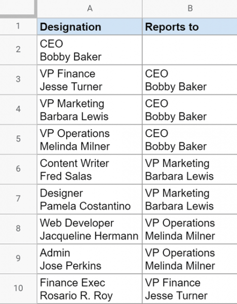
For aesthetic reasons, I added the person’s name to the next row in the same cell. This way, you can keep your org chart from getting too sprawling.
To use this data to create a vertical org chart display in Google Sheets:
- select the entire dataset
- Click the “Insert” menu
- Click “Chart
- In the Chart Editor, on the Settings tab, click the chart type dropdown
- Please select an organization chart
- Check the “Use row 1 as header” option
This will give you an org chart as shown below:
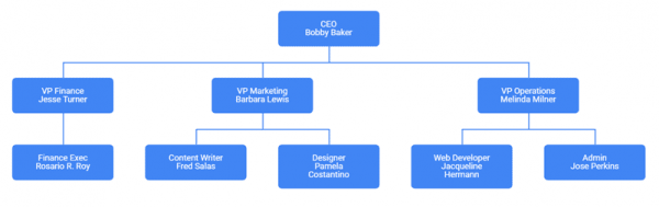
Because each box has a name, this type of org chart may be slightly wider than a designation-only org chart.
Related article: How to create a Gantt chart in Google Sheets
How to Make a Hierarchy Chart in Google Docs
Once you’ve finished creating your org chart in your spreadsheet, you can copy and paste it into Google Docs using the keyboard shortcuts Ctrl+C or Ctrl+V.
Google Sheet Org Chart Examples – Customizing the Org Chart
There isn’t much you can customize with an org chart in Google Sheets, but there are two things you can change:
- Organization chart size (small, medium, large)
- node color (box holding designation and name)
- Selected box/node color
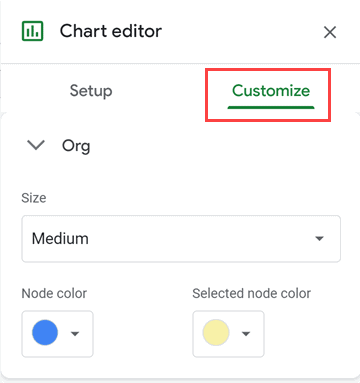
How to Change the Node Color
Org chart customization options aren’t as diverse as other org charts. However, you can change the node color. To change the node color:
- Double-click the chart or click the three dots and select Edit Chart.
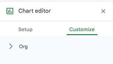
- In the chart editor, go to “Customize.
- Click the organization dropdown.
- Click the node color dropdown and select a different color.
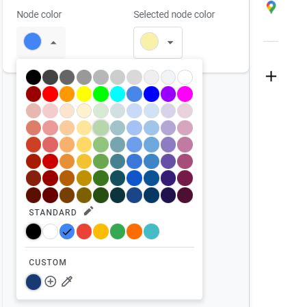
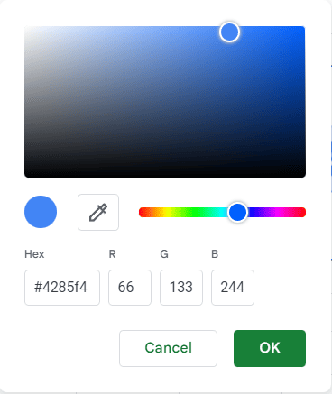
- You can also create your own custom colors.
You can also choose a different selected node color to change the color the node changes to when selected.
By default the font color is white, but there is currently no way to change this in Google Sheets.
Downloading the Org Chart from Google Sheets (as Image or PDF)
It’s great to be able to quickly create an org chart in Google Sheets, but most of the time you’ll use this org chart in a PowerPoint presentation or as part of a Google Docs or Microsoft Word report.
And thanks to the awesome Google Sheets, you can easily export your graph as a PNG file or PDF with just one click
Below are the steps to download your org chart as a PNG file (or PDF file)
- Select the org chart you have already created
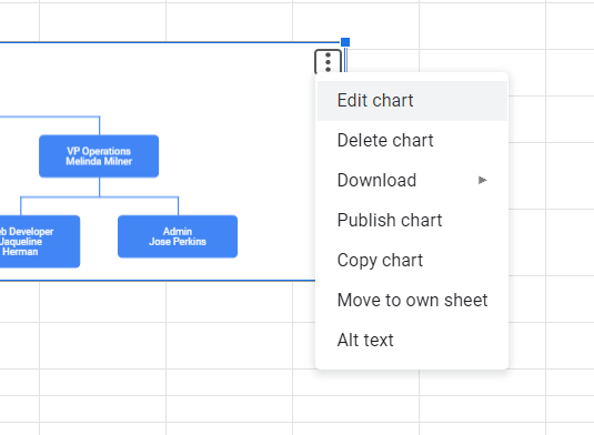
- Click on the three vertical dots that appear in the upper right portion of the graph

- Go to download options and click PNG or PDF
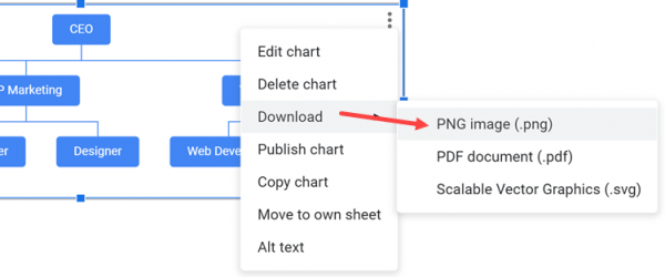
The above steps will instantly download your chart in the file format you selected.
Publish an Org Chart
Clicking on the three vertical dots that appear in the upper right portion of the chart reveals another option called Publish Chart.
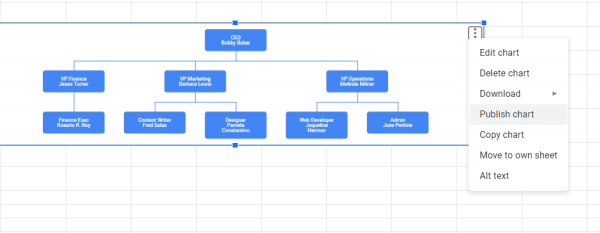
This option allows you to share your chart on your website as a link or by embedding it in your website. You can also use this to create a link that contains the chart as an image. You can share this link with others.
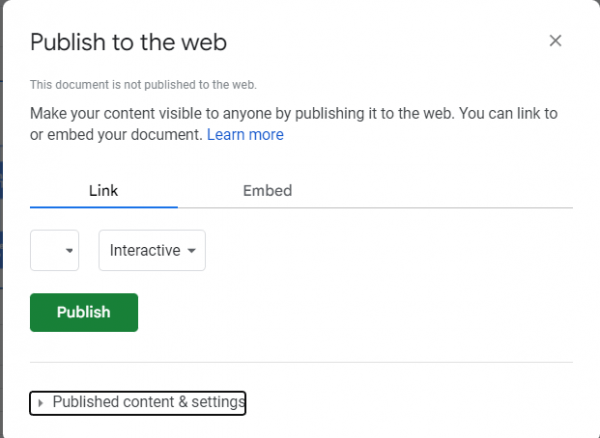
Select Link and click Publish to get a link that you can post on your website. It appears as a link or image, depending on whether you choose interactive or image.
Share the link directly with others so they can view your chart as a website.
If you want to embed the graph on your website, click Publish and the HTML will be generated.
You can copy this HTML and paste it into your website editor to embed it. It appears as a link or image, depending on whether you choose interactive or image.
One thing to note is that when changes are made in Google Sheets, the charts on the website are automatically updated.
What to Do if the Org Chart is Too Wide to Display
Especially for large companies, the data can be very large and the org chart may be too wide to display. Here are some tips to solve it:
- Writing the data in the table in blocks makes the nodes thinner.
- Set the organization chart smaller in the customize menu.
- When selecting a chart, use the small squares on the corners and edges to resize the chart.
If your org chart is still too wide after following these steps, the best option is to split the org chart into multiple org charts. You can create a main organizational chart and a departmental organizational chart.
Frequently Asked Questions
How Do You Create an Organizational Chart in Google Sheets?
- Enter the data for each step of the graph in the left column
- Place the heading of each input on the left side of the column next to it. For example, place fruits next to apples and oranges, and vegetables next to carrots. Food can also be the main box in the org chart next to vegetables and fruits
- Highlight a cell and click the Graph tool in the toolbox menu
- Find and click on the org chart in the options
Does Google Have an Org Chart Template?
It’s not the default, but you can download the template from this article and change the data to suit your needs.
That was how you can easily create and customize a Google Sheets org chart. Once created, you can export it as a PNG, PDF, or SVG vector file for further use.
Can you Make a Horizontal Org Chart in Google Sheets?
Unfortunately, there is no way to create a horizontal org chart in Google Sheets. If you absolutely must create one, you can use Google Slides instead, but unlike Google Sheets, the entire process must be done manually.
What Is the Easiest Way to Create an Org Chart?
Simply download our Google Sheets org chart template and change your business details. Alternatively, there are many apps on the internet that are built specifically for creating org charts.
We hope you found this tutorial useful on how to create an org chart in Google Sheets.
Now that you know how to create a Google Sheets org chart, I also recommend these tutorials: