When it comes to visualization, visually appealing and well-laid charts are at the heart of every project.
Luckily, creating charts in Google Sheets is easy and you can create beautiful charts that visually display data already stored in your Google Sheets file. Google Sheets charts include many types of charts, from simple bar and pie charts to more complex radar, treemap, and geographic (using Google Maps) charts.
This Google Sheets chart tutorial will give you the knowledge to create the most complex charts in Google Sheets.
Contents
- 1 Navigating This Guide
- 2 How to Create a Chart in Google Sheets
- 3 Download a Copy of Our Example Sheet
- 4 Google Sheet Chart Types
- 5 The Chart Editor
- 6 Difference Between a Chart and a Graph
- 7 How to Move and Remove a Google Sheets Chart
- 8 How to Make Google Spreadsheet 3D Chart
- 9 How to Copy and Paste Google Spreadsheet Graph
- 10 Downloading Your Chart
- 11 Advanced Tips
- 12 Conclusion
This guide is just a brief description of the different types of charts. However, each chart type has a link to a full in-depth guide. Or you can learn it all at once from our comprehensive Google Sheets guide.
How to Create a Chart in Google Sheets
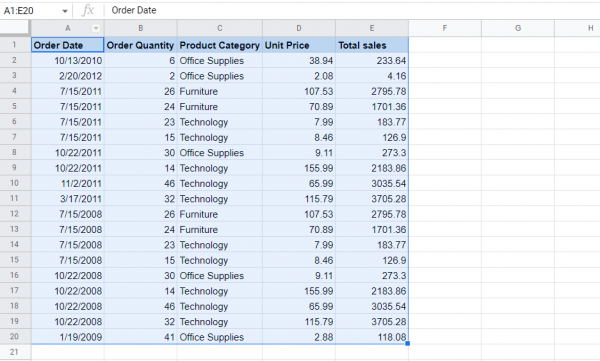
Before you can start creating your chart, you need to prepare your data. This can be done in a number of ways, such as creating a pivot table. Creating a graph is very easy and can be done in two ways. Here’s a step-by-step guide on how to create charts in Google Sheets:
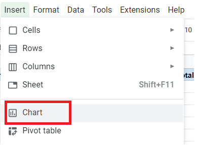
Step 1: Select the data range.
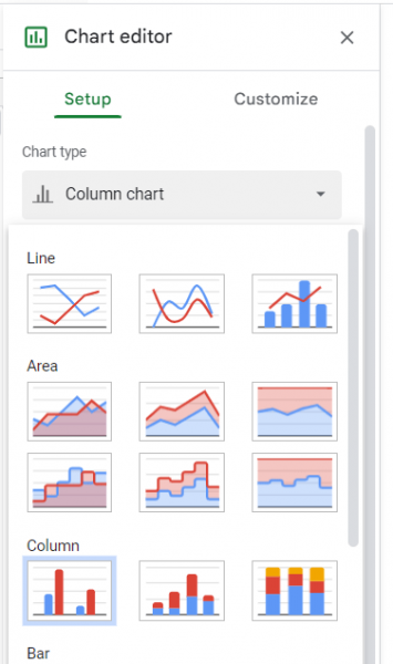
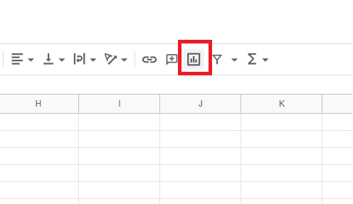
Step 2: Go to Insert > Chart. A chart editor will pop up on the right
Step 3: You can select the type of graph you want in the graph editor.
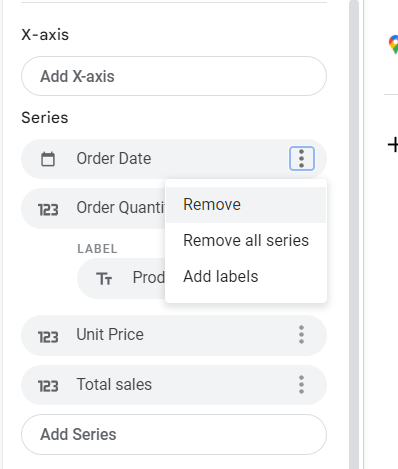
Step 4: Under Series, you can also click Add or Remove to select columns to display in the chart.
When you’re done, you can edit and customize the chart as desired or close the chart editor. The second option for step 2 is to select the “Charts” button on the toolbar.
Google Sheets chooses the chart it thinks the data fits. This is an automated process and may be imprecise in some cases. However, in many cases this prediction may be correct. Create a chart and use that data to populate the title, legend, and axes. You’ll also notice that the chart editor sidebar loads at this point.
Note that if you close the graph editor and want to reopen it later, you can do so by double-clicking anywhere on the graph.
Download a Copy of Our Example Sheet
If you want to experiment with Google Sheets charts, you can make a copy of the chart sample spreadsheet. There are also some examples of chart sheets in the spreadsheet. If you find this sample sheet useful, please also consider checking out our paid templates.
Google Sheet Chart Types
Now that you’ve created a chart for Google Sheets, let’s take a look at the different charts available in Google Sheets. We will start with the most commonly used charts and work on more complex types of charts.
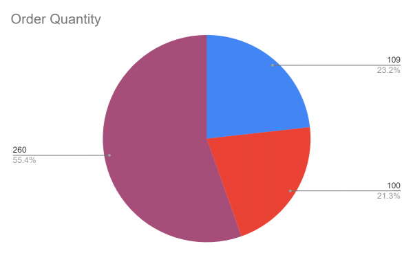
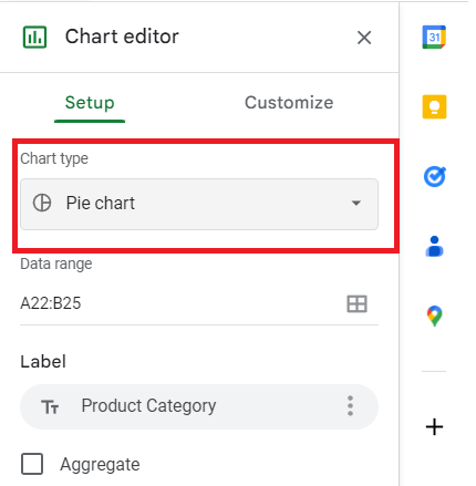
Pie Charts
Pie charts are probably the most commonly used spreadsheet charts. Most people are familiar with pie charts, which are great for visualizing simple data. They are often used in budgeting because they represent a single item (that is, an expense). A pie chart uses a pie, disk, or donut divided into sections based on data.
How to Make a Pie Chart
Here are step-by-step instructions on how to create a pie chart:
Step 1: Select data.
Step 2: Go to Insert > Chart.

Step 3: In the chart editor, go to the Chart type dropdown menu.

Step 4: Select Pie Chart.
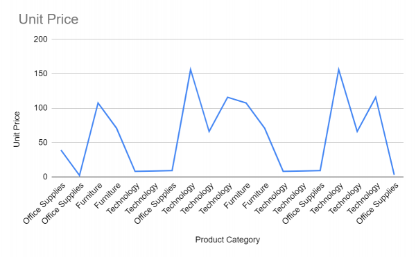
Line and Area Charts
line charts or line charts and area charts are very similar. Both use the x-axis to show time periods (i.e months) and the y-axis to show the visualized metric. The only difference between them is that they have a little more color. A line chart is a rectangular chart made up of lines that connect points. Area chat, on the other hand, shows the space below the lines in the chart area shaded. This can potentially help identify visuals faster. Both graphs can be used to visualize the changes in numerous metrics over time.
How to Make a Line Chart
Here’s how to create a line chart in Google Sheets:
Step 1: Select data.
Step 2: Go to Insert > Chart.
Step 3: In the chart editor, go to the Chart type dropdown menu.

Step 4: Select Line Chart.
Column and Bar Charts
These charts resemble line and area charts in overall layout, but display columns or bars instead of points connected by lines. They are not connected, so you can compare multiple metrics side-by-side for each period (e.g week).
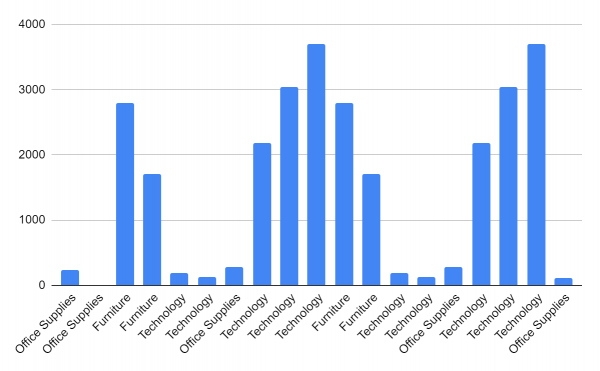
In Google Sheets, horizontal bar charts are the same as vertical bar charts, except that they are horizontal bar charts. In such cases, the x and y axes are usually reversed.
How to Make Column Charts
Normally, when you insert a chart into Google Sheets, it automatically appears as a column chart, but just in case, here’s a step-by-step guide on how to create a column chart:
Step 1: Select data.
Step 2: Go to Insert > Chart.

Step 3: In the chart editor, go to the Chart type dropdown menu.
Step 4: Select Column chart.
More information: How to create a bar chart in Google Sheets
Stacked Column, Bar, and Area Charts
A stacked bar chart is similar to the standard version. However, the metrics are stacked in different colors to show how the composition of different items changes over time.
Scatter Charts
the scatterplot has a diagonal line (xy plane) that goes from the bottom left to the top right going up the metric results. The data is then visualized as points around that line. These dots create a scatterplot highlighting the target area. Often this is used to get a quick overview of a property’s cost and square footage. This can be effectively used to show the relationship between two metrics.
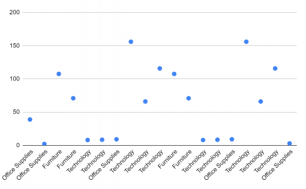
More information: How to create a scatterplot in Google Sheets
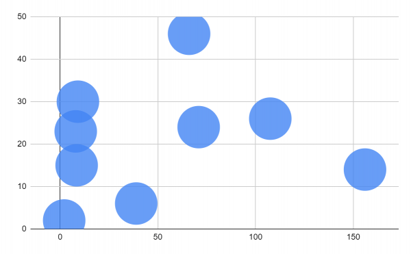
Bubble Chart
A bubble chart is a method of representing data using multiple pies or bubbles. This is similar to a scatterplot, but uses bubbles instead of dots and shows the density of data points by including her third number in the size of each of these bubbles.
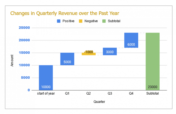
Waterfall Chart
A waterfall chart is a form of data presentation that shows how values affect positive and negative changes. The chart consists of bars showing the opening and closing values of a quantity, interconnected using floating bars (or bridges).
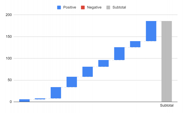
A floating bar shows how the starting value rises and falls until it reaches the ending value. This kind of chart is especially common for stock data. The bars in the waterfall chart are color coded to indicate whether the change is positive or negative.
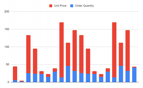
Combined Charts
Combo charts combine two or more different chart styles, such as column charts and line charts. It’s an insightful way to view and compare multiple datasets simultaneously.
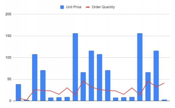
To create a combo chart, you need two datasets with a common string field such as time.
Candlestick chart
A candlestick chart is a type of chart used in financial analysis to show price highs, lows and determine the base of movement based on this pattern. One candlestick usually represents four important data points.
Google Sheets requires at least 5 columns of data for candlestick charts.
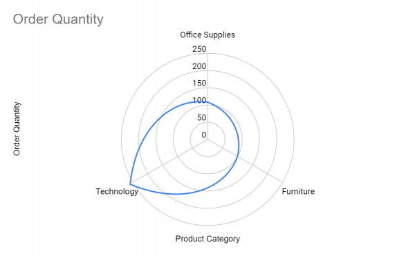
Radar chart
This graph is used to display data with multiple variables. Used to compare multiple aspects of multiple elements. It is also called a spider chart because it resembles a spider’s web.
Geo Charts
These graphs use maps and show concentrations by region. They are great for visualizing sales data when understanding the target market area of a company’s customer base. Google Maps provides a map of this graph embedded in a Google Sheets graph.
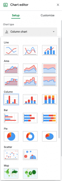
The Chart Editor
The chart editor is literally where you can edit your charts. Using this editor, you can change data ranges, chart types, visual effects, and more. It consists of two aspects of him, the setup editor and the customization editor.
Setup Editor
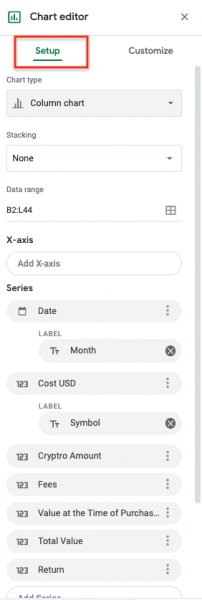
data range
- Range used for data.
- If you select a data table cell at the beginning of this process, it will automatically be selected.
- A different range can be selected using the grid button to the right of the current range.
X-axis
- horizontal axis selector.
- The horizontal axis is automatically set based on the data.
- If it is incorrect or the data has changed, you can update it here.
- To edit the range, click on the name of the x-axis and an option box will appear to select a different range.
- Labels are set based on the column labels in the data table. You have to change the column labels in the data table or change them in the customization section.
Aggregation checkbox
- This checkbox allows you to select and aggregate data options for the data series.
- Some datasets are not suitable for this, while others require it.
series
- Where to view and edit data series.
- Labels are set based on the column labels in the data table. You have to change the column labels in the data table or change them in the customization section.
- To edit the range, click on the name of the series and an option box will appear to select a different range.
- You can also add new series here. These series should be in the same size range, but need not be contiguous. Example: If the series are in columns B4:B17, C4:C17, and D4:D17. You can also include series in columns H4:H17.
Checkbox
- Swap Rows/Columns: Swaps rows and columns if the table is on the other side of this table.
- Use row * as header: Use the row in the header position of the table.
- Use column * as label: Use any column at the label position.
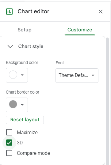
Customize Editor
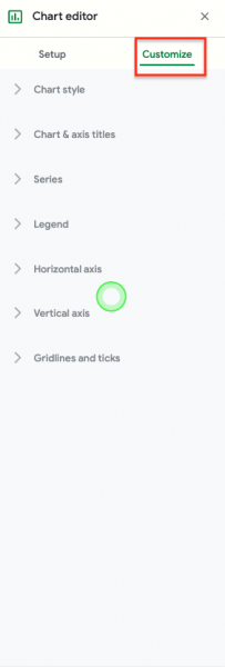
chart style
- Here you can edit the entire chart element. This is how you create visually appealing charts with the colors and features of your choice. Users often use this to match charts to existing color schemes or brand colors.
- You can change the background, fonts, and borders.
- Checkbox:
- Smooth: Removes jagged edges from line charts
- Maximize: Removes blank border space and expands to the maximum amount.
- 3D: Change to 3D graph.
Graph and axis titles
- This section presents a dropdown that allows you to select the title of the chart you want to edit.
- You can edit the graph title, graph subtitle, horizontal axis title, and vertical axis title.
- You can edit the text, font, position, color and size.
series
- Series allows you to edit chart visualizations.
- This section presents a dropdown that allows you to select the series you want to edit.
- You can now edit the color, opacity, dash type, line thickness, point size, and point type.
Legend
- You can change the position, font, and color of the graph legend.
vertical axis
- You can change the minimum/maximum value, scale format, and number format.
grid lines and ticks
- You can change the gridlines and tick marks on both the vertical and horizontal axis.
- In this example, the vertical axis has more options. You can change the spacing, number and color, and choose different tick marks and grid lines.
- In this example, there is only one choice for the horizontal axis, tick marks along the axis.
Difference Between a Chart and a Graph
chart is an umbrella term usually used to define different ways to visually represent data. One graph is used to represent data by plotting values on the vertical axis (y-axis) and the horizontal axis (x-axis).
however, people often use these terms interchangeably. For the sake of clarity, there are charts that cannot be called charts, such as pie charts, geo charts, area charts, bubble charts, waterfall charts, heat maps, radar charts, and spline charts. These usually do not have x and y axes.
Graphs, on the other hand, are line graphs, bar graphs, histograms, candlestick charts, etc.
Note that all graphs are treated as charts in Google Sheets. Graphing in Google Sheets is therefore done the same way for all graphs.
How to Move and Remove a Google Sheets Chart
You can easily move charts around the sheet if you want to position them. Just click, hold the cursor, and drag it where you want it.
If you want to remove the graph, there are two ways. You can cut using the keyboard shortcut CTRL + X
For the second method:
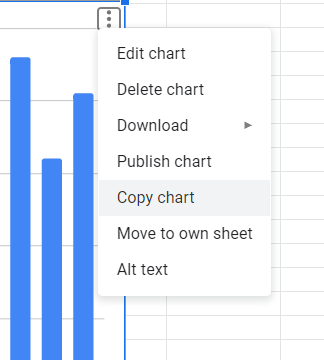
Step 1: Click on the three dots in the upper right corner of the chart to open the chart options.
Step 2: Select Delete Graph.
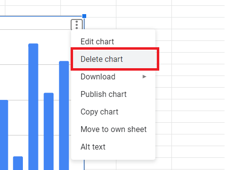
This will permanently remove the cart from the sheet. If you accidentally delete a graph, you can always restore it using the keyboard shortcut CTRL + Z.
How to Make Google Spreadsheet 3D Chart
To create a 3D chart in Google Sheets:
Step 1: Select data.
Step 2: Go to Insert > Chart
Step 3: Go to Chart Styles and select the chart you want .
Step 4: Go to Customize > Chart Style
Step 5: Check the 3D box
How to Copy and Paste Google Spreadsheet Graph
Once you’ve finished creating your chart in Google Sheets, there are several ways to share your chart. One way is to copy and paste.
You can also copy the chart and paste it to another sheet or paste it into Google Docs.
Here’s how:
Step 1: Click on the three dots in the upper right corner of the chart to open the chart options.
Step 2: Select Copy Chart.
Step 3 : Navigate to where you want to paste the graph, right click and select Paste. You can also use the keyboard shortcut CTRL + V
Step 4: You will be prompted to choose to link to the spreadsheet or paste without linking. Click Link to Spreadsheet if you want the chart to update to reflect any changes you make to the original data.
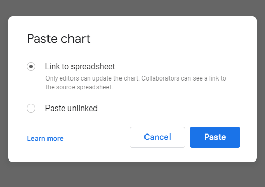
Step 5: Click “Paste.
The spreadsheet is pasted into the new location you selected. If you choose to paste without linking, it will simply be pasted as an image.
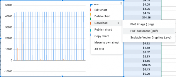
Downloading Your Chart
After creating a chart, you may need to download it to distribute to your team via email. Luckily, Google Sheets has this built in, allowing you to download files to his PNG, PDF, or SVG. To do this, you have to hover your cursor over the chart. When you do this, you should see three dots in the upper right corner of the graph. Click on the three dots and a dropdown will appear. Go to Downloads and select the file type you want to download.
Advanced Tips
Google Sheets charts have some more advanced options that I won’t go into in detail here, but this gives you other options for your charts.
- Charts in Google Sheets can be made public by creating a link and making that link available for users to view.
- Charts in Google Sheets can connect directly to Google Presentations, so you can update the data in your sheets without adjusting your presentation each time.
- If you have Google App Script, you can program your sheet to email a PDF or PNG created from a Google Sheets chart to a list of team members at the same time every day, week, or month.
Conclusion
Google Sheets Charts is a premier data visualization tool that creates visuals that display your data. These visualizations are key to making informed decisions and delivering effective points. We’ve shown you how to create charts in Google Sheets and some examples of different charts.
We hope that this tutorial will help you to use this great tool effectively and become more effective at creating charts in Google Sheets.
For more Google Sheets chart tutorials, see here: