Waterfall charts, also known as McKinsey charts, are becoming an increasingly popular visualization tool. These charts have several names and are sometimes called cascade charts or bridge charts. Less common names include flying brick charts and Mario charts.
Waterfall graphs provide a great way to visualize changes in quantity over time. These are new additions to the Google Sheets Charts collection. Until then, Google Sheets users had to manually create customized stacked column charts. Now users can quickly and easily create waterfall charts in Google Sheets with just a few clicks.
This tutorial will show you how to create a McKinsey waterfall chart in Google Sheets and how to format and customize it.
Contents
- 1 What is a Waterfall Chart?
- 2 What Are Waterfall Charts Used For?
- 3 How to Make a Waterfall Chart in Google Sheets
- 4 Customizing the Google Sheets Waterfall Chart
- 5 Including Additional Subtotals
- 6 FAQs
- 7 Conclusion
What is a Waterfall Chart?
A waterfall chart is a visualization tool that helps show how values are affected by a series of positive and negative changes. The chart consists of bars showing the opening and closing values of a quantity, interconnected using floating bars (or bridges).
A bridge shows how the starting value rises and falls until it reaches the ending value. The bars in the waterfall chart are color coded so you can quickly see if the change is positive or negative.
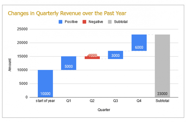
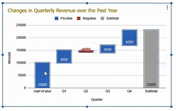
Below is an example of a waterfall chart showing quarterly changes in revenue over a year:
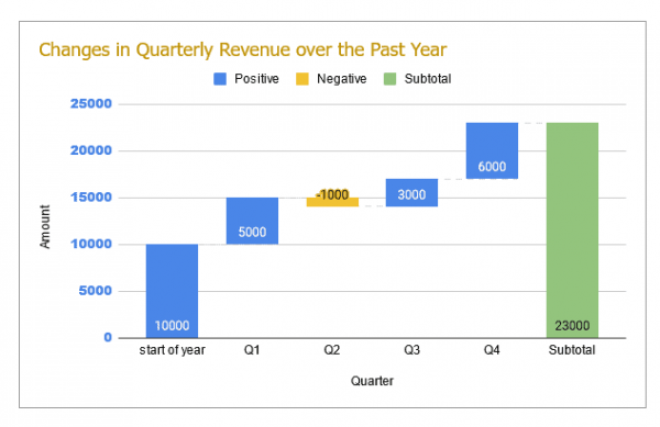
Note that the start and end value columns start from the horizontal axis (or x-axis) and the middle columns float.
These floating bars are what give the chart a “waterfall” look. You can also add subtotal columns to your chart, or split columns to create stacked waterfall charts.
What Are Waterfall Charts Used For?
McKinsey waterfall charts are primarily used to visualize how values change over time. They are therefore commonly used in the following applications:
- To visualize personal cash flow
- To visualize changes in the number of employees
- To analyze sales and profits
- gap analysis
- change analysis
How to Make a Waterfall Chart in Google Sheets
Let’s see how to create a waterfall chart in Google Sheets. To demonstrate this, we’ll use hypothetical data on company quarterly earnings:
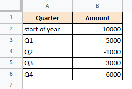
In the dataset above, positive values indicate the amount won (or profit earned) and negative values indicate the amount lost.
Notice that the first column contains the quarter numbers (or text) and the second column contains the values. Additionally, I added a line for the starting cash amount, but didn’t need to add a line for the ending amount.
This is because Google Sheets independently calculates the closing price based on the increase or decrease indicated by the data.
We can create a waterfall chart summarizing the above data as follows:
- Select the range that contains the data you want to visualize in your waterfall chart. In this case the range is A1:B6.
- Select Chart from the Insert menu. Alternatively, you can click the “Chart” icon on the toolbar.


- This should display the chart on the sheet and also display the chart editor sidebar on the right side of the browser window.
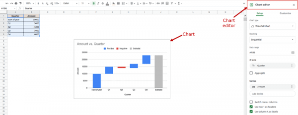
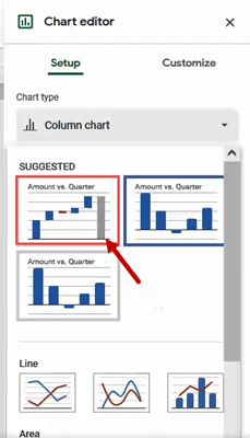
- Google Sheets typically tries to make sense of your data and creates charts that best fit your data. Ideally, you should see a waterfall chart. If so, you can stop at this step. However, if other graphs are displayed, they can be changed as shown in step 5.
- To convert your chart to a waterfall chart, select the Settings tab from the chart editor sidebar and click the dropdown menu under Chart Type.
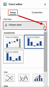
- Select Waterfall Chart from the chart options that appear. It should appear in the “Featured” or “Other” categories.
You should now see a waterfall chart on your sheet as shown below:
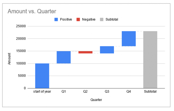
Notice that Google Sheets calculates the subtotals (end values) and plots them as gray columns at the end. Positive values (upward values) are displayed in the blue column and negative values (downward values) are displayed in the red column.
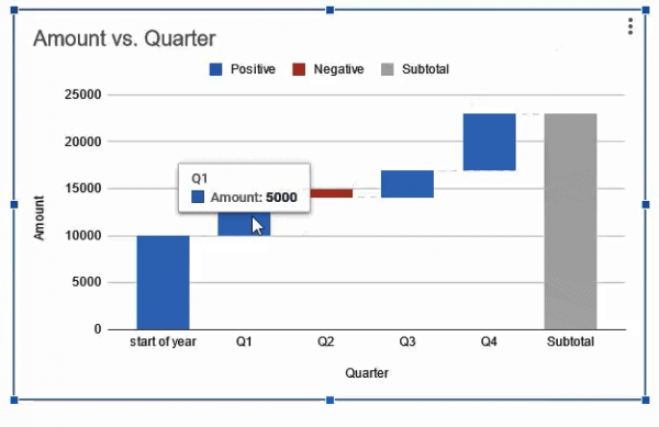
Hover your mouse over any column to see the corresponding value for each.
Now all you have to do is customize the chart to suit your requirements.
Customizing the Google Sheets Waterfall Chart
If you want your charts to look great, Google Sheets offers a wide variety of customization options. Let’s look at some of these.
Changing the Chart Title
The chart title is the first thing people see in the chart. At a glance you can see what the chart means. If you want to change the chart title of a waterfall chart in Google Sheets, double-click the chart to open the chart editor sidebar. Then select the Customize tab and click the Chart and Axis Titles category.
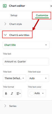
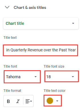
You can now remove, change, or format the chart title using the options presented in this category. In this example, here are the changes we made to the chart title:
- Changed chart title text to “Change in quarterly earnings over the past year”.
- Changed title font to Tahoma
- Set the title font size to 18
- Set the text color of the title to “Dark Yellow 2”
Changing the Chart Style
If you want to change the look of your graph and style it according to your requirements, you can find all the graph style options in the Graph Style category on the Customize tab.
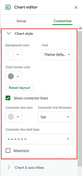
In this category, you can set the chart background color, overall font, and chart borders. Also includes options to hide/show/adjust connector lines.
Hiding / Showing Connector Lines
Connector lines are lines that connect or form bridges between individual columns in a waterfall chart.

By default, Google Sheets displays connecting lines in the form of dashed gray lines. However, you can also adjust it according to your preferences.
For example, if you want to hide all connectors, uncheck the box next to Show connector lines, as shown below.
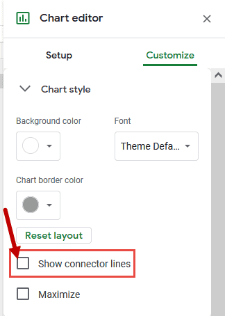
To unhide it, check this box again.
You can also set the color, thickness, and type of dashed line for the connector as desired.
Adding Data Labels / Setting Label Positions
Data labels in charts display additional information. For example, if you want to see the values that each column in your waterfall chart represents, you can add data labels to those columns.
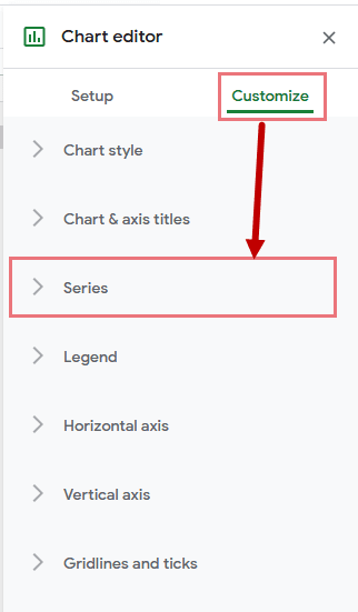
Data label options are found in the Series category on the Customize tab. To add data labels to the columns of your waterfall chart, select the ‘Series’ menu, scroll down and check the box next to ‘Data Labels’.


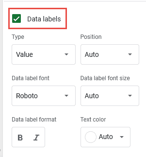
You should see more options for formatting data labels. For example, you can set the font style, size, and color. You can also set the format of the numbers displayed in the data labels and how the data labels are arranged in each column.
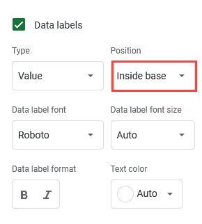
For this example, let’s set the data labels that appear at the inner base of each column, as shown below:
The chart at this point looks like this:
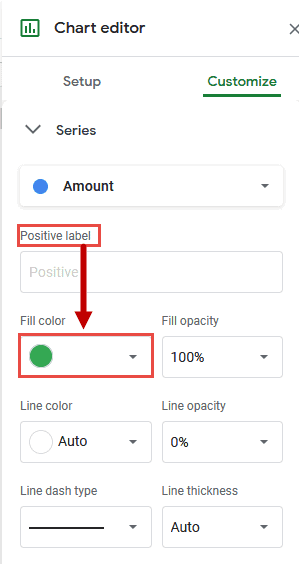
Setting the Column Colors
There is also an option to change the color of the columns according to your preference. For example, you might want the columns with positive values to be green and the columns with negative values to be orange. This option is found in the Series category on the Customize tab.
Double-click on any of the positive columns to change the color of the positive columns.
This will open the “Series” menu. Click the Fill Color dropdown (below the Positive Labels input box) and select the color to use for all positive columns in the chart.
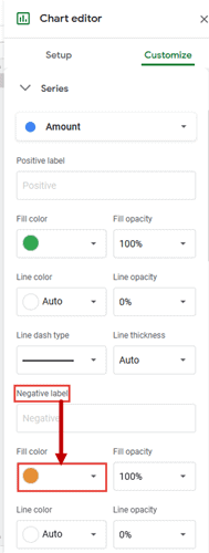
Similarly, to change the color of the negative column, do the same with the Fill Color dropdown below the Negative Labels input box.
Below the “Subtotal Labels” input box is a fill color option to change the color of the subtotal bars.
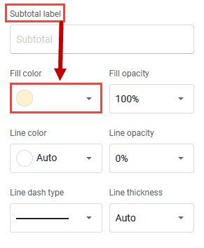
All three categories also have options to change opacity, line color, line thickness, and other settings for each chart column type.
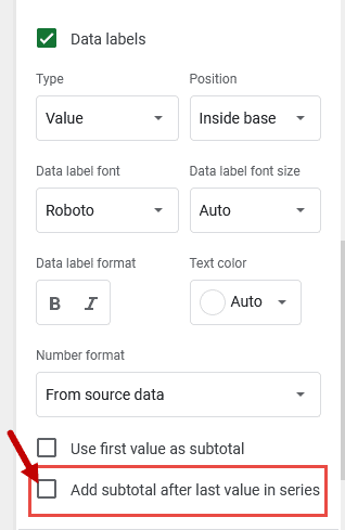
Showing / Hiding the Subtotal as the Last Column
By default, Google Sheets displays the final subtotal as the last column in a waterfall chart. However, if you don’t want to see them, you can remove them by simply unchecking the box next to Add subtotals after last value in series in the Series category.
Other Customization Options
The Customization tab of the Chart Editor has many more customization options. I will briefly describe some of these.
The Legend Category
This category allows you to specify settings and formatting for the waterfall chart legend. You can also remove the legend by clicking the dropdown under ‘Position’ (in the ‘Legend’ category) and selecting ‘None’.
The Horizontal and Vertical Axes Category
In this category, you can change axis-related settings such as axis label font type, color, size, type, degree of axis label scaling, and whether axis lines are hidden or visible.
The Gridlines and Ticks Category
This category allows you to set major and minor grid lines for your waterfall chart. You can select whether to show or hide major and minor grid lines, and change their color and spacing.
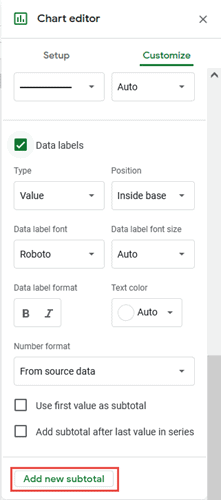
Including Additional Subtotals
In Google Sheets, waterfall charts can also include additional subtotals. For example, you also want to see total revenue for the middle of the year (end of Q2). The great thing is that it doesn’t need to be calculated or included in the data to be displayed on the chart.
A waterfall chart automatically calculates subtotals when you specify where you want new subtotals to appear.
Therefore, to include subtotals from Q2 onwards, follow these steps:
- Click the Add New Subtotal button under the Series category (in the Customize tab).
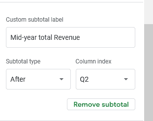
- Enter a label for this new subtotal. In this example, we’ll label it as ‘Mid-Year Gross Earnings”.
- Leave Subtotal Type as ‘After’
- Select Q2 from the Column Index drop-down list (because we want to insert a new subtotal after the Q2 column).
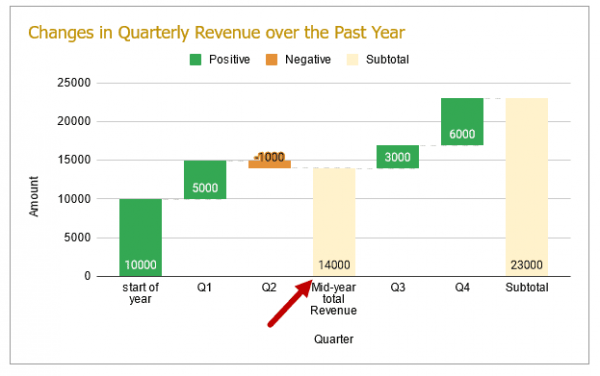
A new subtotal column appears after the Q2 column, showing the total earnings calculated since the second quarter.
Note: If you want to replace columns with subtotals, you can also select the “replace” subtotal type in step 3.
FAQs
Can you do a waterfall chart in Google Sheets?
Yes, since December 2017, Google Sheets has introduced waterfall charts as part of its chart collection.
How do I remove subtotals from a waterfall chart in Google Sheets?
To remove subtotals from a waterfall chart, follow the steps given below:
- Please select a chart
- Click the ellipsis button (three dots) in the top right corner of the chart
- Select “Edit Chart” from the menu that appears
- This will open the chart editor sidebar on the right side of your browser window.
- Select the Customize tab
- Click on the “Series” menu
- Scroll down and uncheck the box next to ‘Add subtotal after last value in series’.
The subtotals should now be removed from the waterfall chart.
How do you add data labels to a waterfall chart?
To add data labels to your waterfall chart, follow these steps:
- Please select a chart
- Click the ellipsis button (three dots) in the top right corner of the chart
- Select “Edit Chart” from the menu that appears
- This will open the chart editor sidebar on the right side of your browser window.
- Select the Customize tab
- Click on the “Series” menu
- Scroll down and check the box next to ‘Data Labels’.
- More options are displayed for formatting the data labels. You can use these to further format the data labels as per your requirement
How do I create a stacked waterfall chart in Google Sheets?
You can also create stacked waterfall charts in Google Sheets. Stacked waterfall charts allow you to view the contribution of multiple values in each category by stacking multiple values in each floating column.
For example, let’s say you have the change in earnings for two branches of a company (Branch A and Branch B) over a year as shown below:
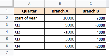
In such cases, a stacked waterfall chart can be used to show how the total revenue has changed over the years.
Creating a stacked waterfall chart in Google Sheets is as easy as creating a regular (or sequential) waterfall chart. Here are the steps:
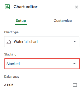
- Select the data range (A1:C6 in this case)
- From the main menu go to Insert → Chart
- You should now see a waterfall graph in your worksheet. If not, select Waterfall Chart from the dropdown under Chart Type (in the chart editor sidebar)
- On the Setup tab, click the dropdown list under ‘Stacking’ and select ‘Stacking’.
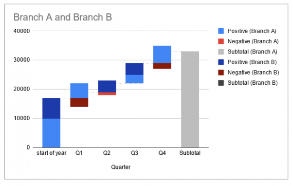
- Your waterfall chart should now be converted to a stacked waterfall chart, showing values for both branches A and B in each floating column, including the start column.
- Then you can experiment with different options in the Customize tab of the chart editor to customize the chart to your liking.
Conclusion
This tutorial was about waterfall charts in Google Sheets. We’ve covered what these are, how they work, and how to create them to provide great visualizations for your data. We hope you found our content useful and easy to understand.