Pareto charts can be powerful visualization tools if you understand how to create and interpret them. They are great for visualizing causal phenomena and are used by many organizations to identify problem areas and room for growth.
This tutorial will teach you everything you need to know about Pareto charts in Google Sheets. Learn what they are, how they are used, why they are used, and how to create and customize them in Google Sheets.
Note: At the time of this post, Google Sheets does not offer a separate template option for creating Pareto charts.
Related reference: College application spreadsheet template
. However, you can easily create one by customizing your combo chart.
Contents
What is a Pareto Chart and What is it Used for?
Simply put, a Pareto chart is a combination of a bar chart and a line chart. This is based on Pareto’s Principle, which states that in most situations, about 80% of the effects are the effects of 20% of the causes.
Therefore, if only 20% of the identified causes can be addressed, the vast majority of problems can be solved to a greater or lesser degree.
Pareto charts use the frequency distribution of a variable and the cumulative percentages of this frequency distribution to clearly see which categories (causes) of a variable account for the majority of the effect.
A Pareto chart consists of columns (or bars) arranged in descending order to represent the frequency of different categories (or causes). It also consists of a line chart showing the cumulative percentage of the total number of occurrences of the event. In other words, the line graph shows the contribution (percentage) of each cause to the total effect.
It can be difficult to understand at first glance if you don’t know how to view the chart properly. So let me help you do this in detail first.
How to Read a Pareto Chart?
As mentioned earlier, charts consist of bar graphs and line graphs.
the horizontal axis (x-axis) of the graph represents different categories or causes. The vertical axis of bar charts is usually displayed on the left side of the Pareto chart. Each bar represents the frequency of occurrence of a particular category.
There is also a second vertical axis on the right side of the Pareto chart. This axis is for line charts and represents the cumulative percentage of total occurrences (by category).
Therefore, for each category, the points on the line represent what percentage of the total occurrences that category accounts for. This means that if a line chart for a particular category shows a cumulative percentage of 10%, 10% of the total occurrences are from that category.
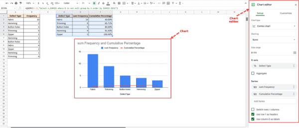
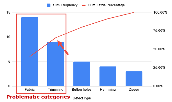
To understand this better, let’s look at an example graph. The following Pareto chart shows different types of product defects along with their frequency of occurrence and cumulative percentage of their impact.
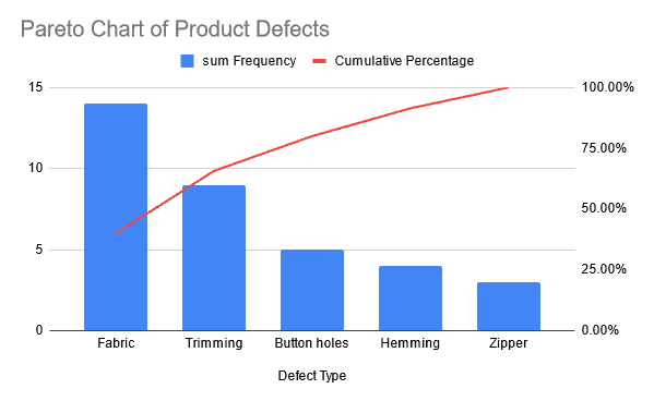
Each bar in this graph represents the frequency or number of occurrences of a particular defect. Each point in the line graph represents how much of the total number of occurrences each product defect represents (or the cumulative percentage of each type of defect).
Note that the bars are in descending order (highest to lowest).
As you can see, the cumulative percentage line is steeper until the trimming defect is reached. As long as this line is steep, defect type has a cumulative effect. These are the defects that have the greatest impact and therefore require the most attention.
Once the line begins to flatten out, the defect in question is not as significant and does not require as much attention.
How to Make a Pareto Chart in Google Sheets
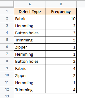
Now let’s see how to create a Pareto chart in Google Sheets. Suppose we have the following frequency table consisting of the frequencies of various types of defects on a fictitious textile production line:
Create a Pareto chart to see which defects are the most critical and account for most of your losses.
Step 1: Prepare the Source Data
Before creating a Pareto chart, you need to prepare your data so that Google Sheets can easily interpret it and convert it into a proper Pareto chart.
The first step in data preparation is to summarize the ’cause’ or ‘defect’ data.
Step 1.1: Summarize the Data
Our dataset contains separate counts for each defect type. Therefore, we should summarize this and group the numbers by type of defect.
For this you can use the QUERY formula in cell D1 like this:
=QUERY(A1:B,”select A,SUM(B) where B is not NULL and group by A”)
The above formula uses the QUERY function to select columns A and B, group the columns by A (defect type), and sum column B (frequency) for each group.
Here are the results I get:
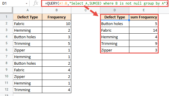
All data in columns A and B are taken into account, so any future additions will automatically update with the query results.
Note: When inserting a QUERY formula into a cell, make sure that the column corresponding to that cell and the next column are both blank. That way the result of the function can span both columns without error.
Step 1.2: Sort the Data
Next, we need to sort the dataset by total frequency. This is so that the chart displays the bars in descending order of height.
For this, the same QUERY expression can be further updated as follows:
=QUERY(A1:B,”Select A,SUM(B) where B is not null group by A order by SUM(B) DESC”)
Just add an “order by” clause to the same QUERY function.
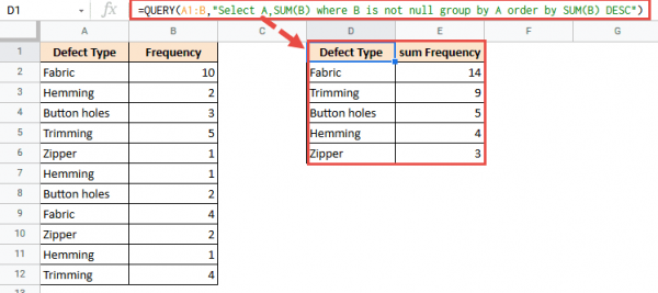
The data is now sorted by total frequency.
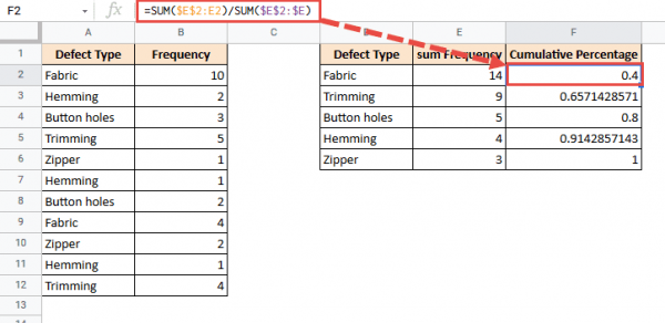
Step 1.3: Add a Column for Cumulative Percentage
After sorting the data by total frequency, calculate the cumulative percentage. You will need the cumulative percentages to create the line chart portion.
To calculate cumulative percentages, use column F and give it the header label “Cumulative Percentage”. Then insert the following formula in cell F2:
=SUM($E$2:E2)/SUM($E$2:$E)
Paste this formula into the last row of your data range.
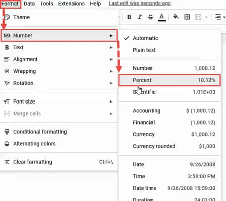
To convert these values to percentages, select all the cells in column F and click Format > Number > Percent.
Here are the results I get:
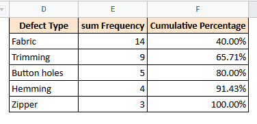
Now we are ready to plot the data. Note that the last cumulative percentage is 100%.
Step 2: Plot the Pareto Chart
To create a Pareto chart, follow these steps:
- Select your data. In this case select cells D1:F6.
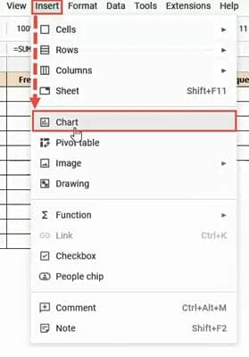
- Select Chart from the Insert menu.
- The chart appears on the sheet and the chart editor sidebar appears on the right side of the browser.
- By default, Google Sheets displays a combo chart (a combination of a bar chart and a line chart). If not, you can convert the chart to a Pareto chart by following these steps:
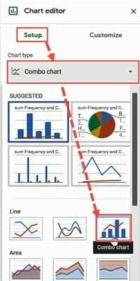
- Click the “Settings” tab in the chart editor.
- Click the dropdown under Chart Type.
- Select “Combo Chart” from the various chart options that appear. The Combo Chart option can be found in the Recommended or Line categories.
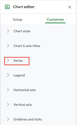
- Click the Customize tab in the chart editor.
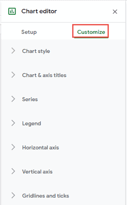
- Click on the “Series” section to see all series settings for the chart.
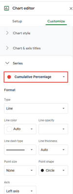
- Select ‘Cumulative Percentage’ from the dropdown just below ‘Series’.
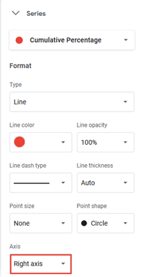
- Change the Axis to “Right Axis”. This will display the cumulative percentage on the right axis of the chart.
Your Pareto chart is ready. The bars in the graph show the individual frequencies of various defects, and the red line shows how the cumulative percentage of defects varies by defect type.
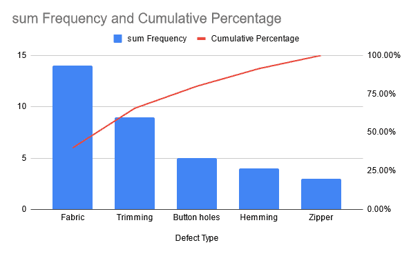
From the graph above, we can clearly see that fabric and trimming defects account for the majority of all defects (because the lines for these two categories are the steepest). In fact, they account for over 65% of all defects.
This means that about 65% of manufacturing defects can be eliminated just by addressing these two types of defects!
Note: The chart title can be changed from the chart editor. Select the Customize tab and open the Chart and Axis Titles section. The chart title appears in the input box under Title text. Please change the title to your liking.
FAQs
How do I make a Pareto chart in Google Sheets?
To create a Pareto chart in Google Sheets, you’ll need to use (and customize) a combo chart. This process was detailed with an example in the final section of this tutorial.
How do you explain a Pareto chart?
A Pareto chart consists of a combination of bar charts and line charts. The horizontal axis of the graph represents different categories or causes. Each bar in the graph represents the frequency of occurrence for a particular category and the lines represent the cumulative percentage of the total number of occurrences (per category).
How do you read a Pareto chart?
To read the Pareto chart, you need to look at the lines corresponding to the first few bars of the bar chart. The category with the steepest line constitutes the “problematic” or critical category. So look for the point where the line starts to bend and the slope becomes gentler. All categories before this point are the most important.
Conclusion
In this tutorial, we’ve covered what a Pareto chart is, what it’s used for, and how to create a Pareto chart in Google Sheets. Based on the 80/20 principle, Pareto charts are a great way to identify and solve problems.
We hope you found this tutorial comprehensive and helpful.